Photoshop

...now browsing by category


Obata’s Photoshop Filter

Friday, July 26th, 2013

One of the most noteworthy things about being a parent, for me, has been watching my son discover the world.  Now five years old, he began as basically a blank slate (although that isn’t entirely the case), and now is an incredibly independent and strong-willed little person.  Like all of us, his personality and his perception of reality is shaped by the world around him.  He has adopted little idiosyncrasies from both my wife and I, as well as his teachers and friends at school and other people in his life.  The way these pieces have combined make him uniquely…well, unique.

That makes him special.  Since we all went through something similar, this same principle makes us all special and unique.  When we talk about originality in art, it’s important to remember that the same processes are at play.  Every artist, regardless of the medium, draws inspiration from various sources, and their art is simply the result of the way in which these sources have combined to spit out something “original.”   I think the distinctiveness of someone’s art is probably a product of many factors, such as how courageous they are to seek inspiration in unlikely places, their experience, the amount of introspection they’ve done to clarify their own vision, etc.

On a recent backpacking trip, I was working my way up a mountain pass that overlooked an alpine tarn.  The blue-green water was shimmering as if it were full of diamonds, the blocky granite surrounding the small lake contrasted that delicacy well, and the sky had perfect puffy white clouds.  What a great scene.

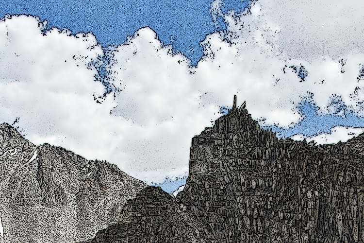
I highlighted the words “blocky granite” in the paragraph above because that’s the aspect of the scene that stood out to me immediately.  I wanted an image of this scene, but how to portray it, such that the granite blocks–almost like cord wood–would be accentuated?  Immediately I thought of the woodblock prints of Chiura Obata, a Japanese-American artist who produced moving paintings of the Sierra Nevada, among other places, in the first part of the last century.

I’ve always had a particular affinity for Obata’s work in the Sierra (three of his pieces–postcards–hang above my desk right now) for many reasons, not the least of which is the incredible sense of place he felt there.  You can see it simply by looking at his work.  When Obata, like many other Japanese-Americans, was sent to internment camps during World War II, he made art there, and you can even feel the sense of place in that work.  It’s a rare quality, but his work has it.

Looking at this alpine tarn, I was inspired by Obata, made some images, and when I got home I did something radical: I attempted to manipulate the image so that it would resemble a woodblock print.

Alpine tarn, John Muir Wilderness

Please make sure to view this one big!

The effect is a bit difficult to see on the computer screen (I imagine this would need to be appreciated as a print), but here is a 100% of the above image to see the result:

Detail, Alpine Tarn

As I said above, I suspect this would make a nice print, but is difficult to appreciate here.  I don’t see myself making these sorts of images with any regularity, but I thought it was important to note my thought process in making this image, because it’s good for every artist to remember that inspiration can come from the most unlikely of places, and to remain open to that.  Additionally, it was an instructive exercise for me, because I got to dive back into Obata’s work, which always makes me very happy.

(Digital) Darkroom Confessions, part II

Thursday, April 26th, 2012

In my last blog post, I talked about my opinion regarding “rules” in photography.  In short, I believe it is okay to manipulate exposure or crop (for example) in order to take an image from visualization to the final product.  In this post, I would like to revisit the image I introduced last time and dissect it a bit.

Navajo Sandstone Cliffs

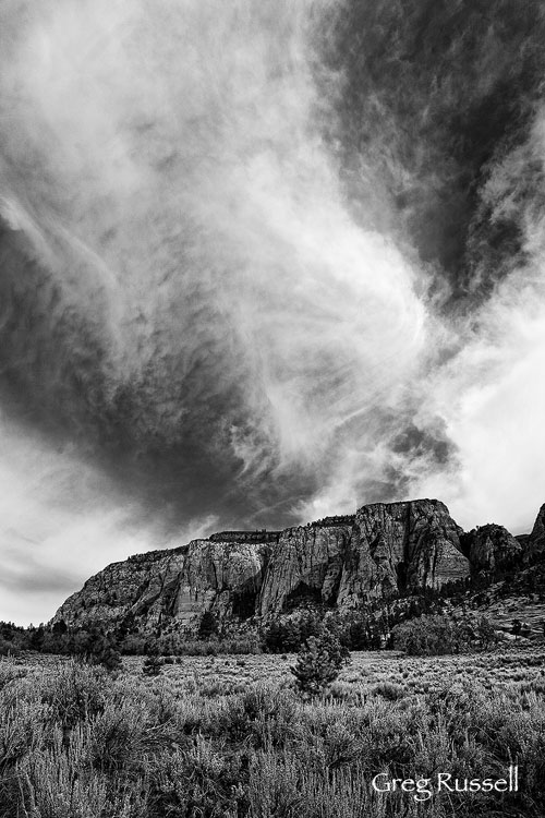
Sandstone & Clouds, March 2012

In the field

I am not normally a “grand landscape” sort of photographer; I tend to focus more on intimate scenes.  However, when I saw these cliffs, what initially struck me was the fact that the buttresses were receding away from me.  Although the mid-morning light had eliminated some of the shadows, I liked that each buttress was casting a bit of a shadow on the buttress behind it.  This alternation of light and dark creates a wonderful sense of depth in images, and was a compositional element I wanted to take advantage of here.

Another confession: guys like me do not normally score skies like this.  Cloudless blue skies are the story of my life.  However, on this particular day, I was loving these high clouds; they were constantly changing and they added a great geometric element to the scene.

For me, the decision of how to balance the composition was pretty easy, and despite the fact I like to think of myself as a rebel, I roughly divided the composition into thirds. I wanted the sky to be the star of the show, so I gave it 2/3 of the frame, and I let the cliffs occupy the remainder.  I like sagebrush, and wanted to leave some foreground in as well; this also gives a good visual “root” for the cliffs to sit on.

To expose the frame, I had a couple of choices.  To underexpose would have meant preserving the shadows that attracted me to the scene.  But, it would also introduce shadows to the foreground, which I did not really want to do.  The alternative I had was to overexpose to the point where the shadows were not as dark while maintaining detail in the rest of the frame.  You have probably heard the phrase, “expose to the right;” that is what I chose to do here.  Phil Colla has a concise and clear explanation of the technique here.

You can always darken a scene in post-processing, but to lighten it up risks introducing noise.

To get the exposure I wanted for the lower part of the image, I had trouble preserving detail in the bright white clouds, so I made two exposures, 1 stop apart from each other.

At home

I opened the RAW files together, and in Adobe Camera RAW I adjusted the images based on the vision I had in the field.  After opening the images in Photoshop, I continued this process.  First I blended the images using a technique I learned several years ago from Younes Bounhar.  You can read about it here.   After checking carefully to make sure the images had aligned properly and there were no artifacts, I made my initial adjustments largely using Nik’s software plug-ins.  The two I used here were the ‘Tonal Contrast’ filter (in Color Efex Pro), and then I used Silver Efex Pro to get the black and white conversion I wanted.

I do not have a lot to offer in terms of strategic choice on this (I did what looked best to my eye), but I only made subtle adjustments and I made careful choices based on my vision.  In choosing the black and white filter, I made sure to keep  the detail in the clouds, but also to make them stand out.  I also kept an eye on the tonal contrast between the sagebrush and the beginning of the cliffs.

I applied a global curves layer, and then used separate levels to mask the cliffs, and selectively darken the shadows.  I saved the TIFF file (with all of the layers), and then flattened, sharpened, and saved a JPEG for the web.

The beauty of image processing is that there is definitely more than one way to skin the proverbial cat.  When you start with a creative vision, you learn ways to arrive at the final product in post-processing.  As you gain experience, you build skills that will eventually become a tool kit that you can selectively choose from when you process more challenging images.

(Digital) Darkroom Confessions, part I

Monday, April 23rd, 2012

When I look in the mirror, I see a man with secrets.

You see, I have broken the rules.


Not only do I consider Alister Benn a good friend, I also consider him a mentor; if I have learned anything from Alister, it is to take control of the image-making process, from visualization to capture to processing in the digital darkroom.  The more I work to embrace this philosophy, the more I realize it involves breaking the rules.  But it also requires a strong understanding of my own vision, as well as the technical capabilities of my equipment.

I have heard the argument several times that photographers should “get the composition right in the camera,” or “get the exposure right in one frame.”   To some extent, I completely agree with the opinion that one should not make a frame with the intent of cropping out an annoying foreground element, or bracket haphazardly, without much thought–these behaviors are often regarded as laziness or a display of lack of knowledge.  As an analogy, this is similar to a student choosing every possible answer on an exam because, “one of them has to be correct.”

However, the other side of the coin dictates that a strict adherence to these “rules” (and others) severely limits the artist’s creative process.  For instance, the image I visualize in the field may not fit perfectly into a 3:4 or 4:5 aspect ratio, and exposing multiple frames for stitching later may not always be practical.  Similarly, if one understands the technical limitations of their camera in exposing for a scene with a high dynamic range, it should be perfectly acceptable to bracket exposures.

In other words, when breaking the rules is in line with vision and an understanding of what the scene demands, it should be encouraged.  Be rebellious.


So, how does an image evolve?  When I was recently in Zion National Park, I was driving along the road and saw a scene that jumped out at me.  Sometimes scenes really present themselves to you.

Navajo Sandstone cliffs

Navajo Sandstone & Clouds, March 2012

It was mid-morning, and I loved the way the clouds contrasted against the cliffs, and the way the buttresses in the rock created layers.  I wanted to emphasize this in the final image, but was presented with a few choices as to how to do it.

In my next post, I will go through my thoughts in the field and a few of the processing steps that led me to the final product.

Mood and creativity in image processing

Monday, December 12th, 2011

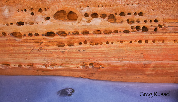
In February, I featured this image as my photo of the month; I took it in Buckskin Gulch, Utah on a cold, icy day.

Ice and sandstone in Buckskin Gulch, Utah

Original Ice Underneath, January 2011

The original scene stopped me because I liked the chilly feeling in the ice, and the way the light was reflecting off the walls of the canyon; the tafoni created an interesting pattern in the flowing rock wall.  In addition, I liked the sensuous line at the rock-ice interface.  However, mostly I liked the contrast between warm and cold tones.

While I was happy with the original edit of the image, I have recently revisited it in an effort to accentuate the feeling the original scene gave me.  With the current state of digital image processing, there are multiple ways to achieve my desired effect.  Guy Tal recently published a great article on understanding white balance; understanding that there can be more than one appropriate white balance within a scene has been immensely valuable to me as my own processing skills have developed.   Ultimately, I chose to use Nik’s Silver Efex Pro to give a slightly cooler color cast to the ice, thus conveying the contrast between warm and cool tones I originally envisioned when I was in the canyon on that cold January day.

Ice and sandstone tafoni in buckskin gulch, utah

Ice Underneath, rework, October 2011

While today’s cameras do an excellent job of capturing the “information” in a scene, there is still work to be done in bringing out the full potential in a scene during post-processing.  What are some of your favorite techniques in doing this?

Incidentally, my friend Guy Tal does have an excellent and in-depth e-book devoted to this subject; you can read more about it at this link.  Note that I’m not a member of his affiliate program, so I get nothing more than good karma if you purchase the e-book.

Blending exposures for greater depth of field

Wednesday, April 7th, 2010

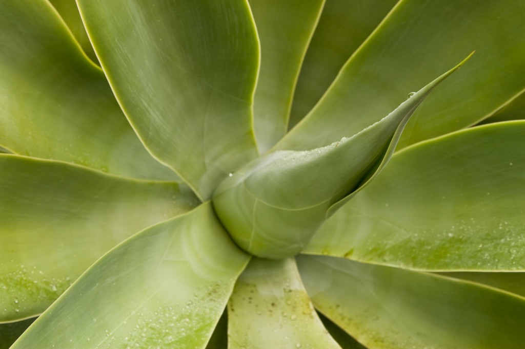
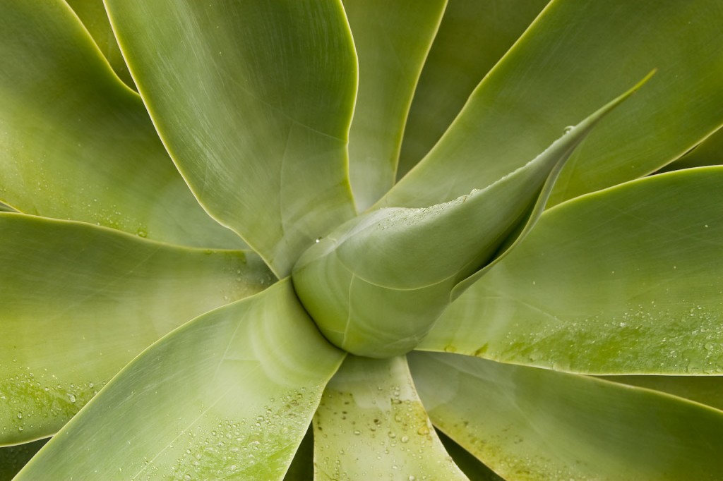
I recently blogged about my winter project of shooting agaves locally.  In prepping for this shoot, I wanted to make sure the entire plant was in focus, and I knew using my depth of field table, that it was essentially impossible using my 24-105/4 lens:

  • The example I’ll use in this post was shot from a distance of ~2 feet at a focal length of 47mm and aperture of f/10; using my Canon 30D, my total depth of field is 0.2 feet.  That isn’t nearly enough to get the entire agave in focus.

To circumvent this problem, I wanted to take multiple exposures at different planes of focus then blend them in Photoshop to produce an image that is entirely in focus.  The problem I was having is that by doing it manually, I couldn’t find a self-feathering method to make the blend look “clean”.  Fortunately Photoshop CS4 has an image blending feature that mostly automates the process for you.  I’ll describe my experience using one of my agaves as an example.

The first step was to take the shots.  I composed the shot like I normally would, and took one or two tests to make sure the amount of fill flash looked about right.  To get the proper diffusion, I taped a piece of white printer paper to my 430EX and underexposed by ~ -1.5 stops EV.  After the shot looked “right”, I took three exposures, each one at a different plane of focus:

While these three images do not look much different, you can see subtle differences; by looking at the main floret protuding from the plant, you can see that it is increasingly out of focus as you scroll through the images.

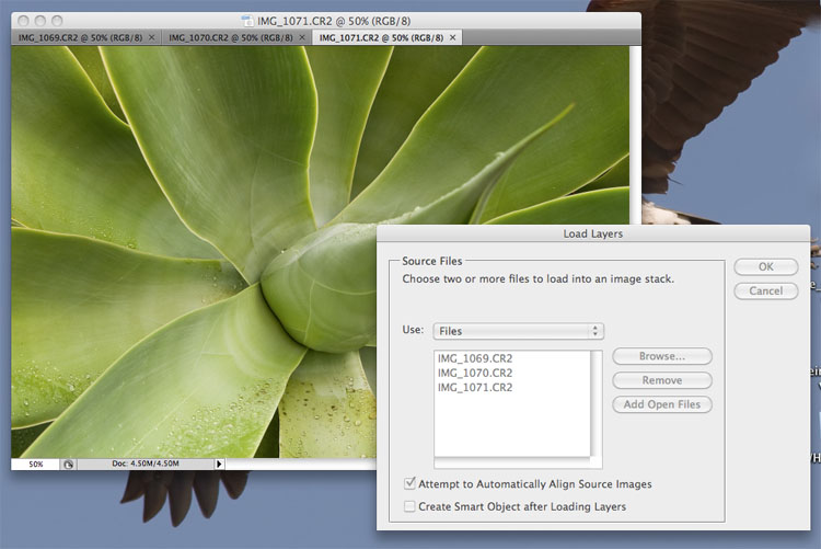
Once I got home, I converted the RAW files in a way that looked good to my eye; when you are working with multiple exposures, make sure to ‘synchronize’ all of your adjustments so all your shots look the same!  This is easy to do in ACR.  Then, I opened the files in Photoshop CS4.  The first step is to load the files into a stack and align them.  You can do this by going to File–>Scripts–>Load Files into Stack

Select the option “Add Open Files”, and check the box that says, “Attempt to Automatically Align Source Images”.  This will load your base images into the script, and will align the images, because even if you shot from a tripod (using mirror lock-up) there will be some slight differences between the images.

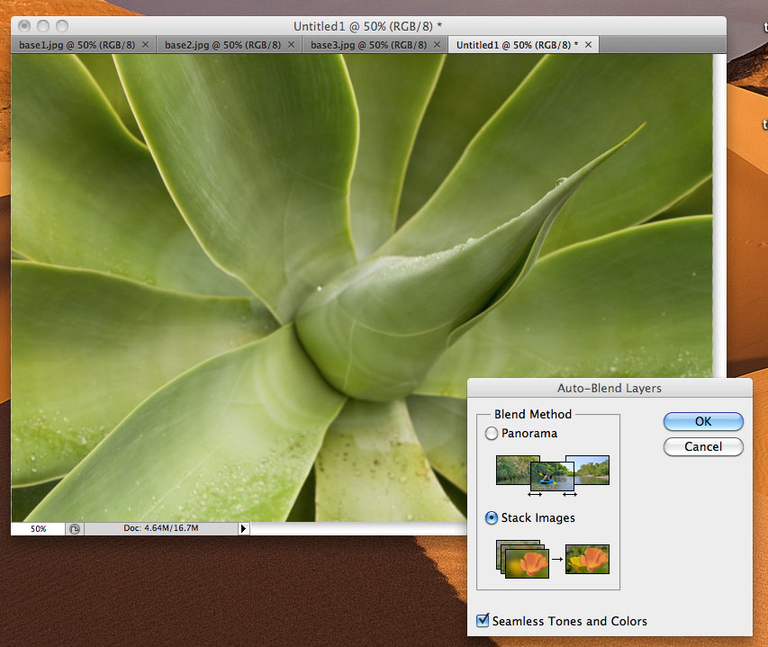
Once the script runs, you will want to select all three layers on the layers palette and go to Edit–>Auto-Blend Layers…

Select the option to stack the images and make sure the “Seamless Tones and Colors” box is checked.  This will produce a perfectly feathered and mostly blended image using your base images.  At this point, I suggest you inspect the image at 100% to make sure it is indeed perfectly blended.  On some images, the script has done a great job, and on others I’ve had to reload some images as separate layers and mask off the “in focus” part.

Even if it doesn’t work perfectly, this method will get you most of the way there.  If you like the result, you can flatten the image and edit as you normally would.

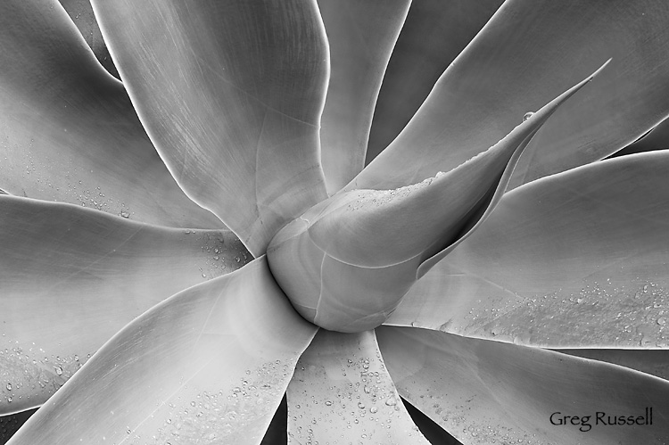
Agave attenuata, blended and converted to black and white

Agave attenuata, blended and converted to black and white

There are times you may not necessarily need to use this method; for instance, sometimes simply stopping down to f/16 or f/22 may get you the depth of field you need, but remember, as you stop down, you are losing resolution.  Thus, shooting at a wider aperture and blending exposures can be beneficial if you plan on printing the image.

Abstract Wild Animal Park photos

Monday, April 5th, 2010

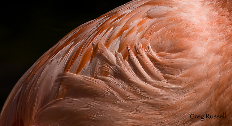
A few posts ago, I talked about a great day at the San Diego Zoo’s Wild Animal Park.  Its a fantastic place to visit, but with large crowds and harsh midday light, photographing animals can be difficult.  Maybe I’m just in an abstract mood lately, but I found a lot of interesting patterns in bird feathers, etc.  One particular shot I liked was of a Chilean Flamingo (Phoenicopterus chilensis), which I’ve honestly never found to be a photogenic bird (at least not in captivity).

By underexposing the image by 1 2/3 stops, I was able to largely blacken the background, and introduce some contrast to the contours of the feathers.  That allowed me to boost the vibrance and saturation a bit, giving an eye-popping splash of color to the Flamingo I’ve always struggled with.

Flamingo feathers, detail

Chilean Flamingo, detail

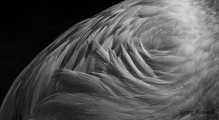
Not only have I been in an abstract mood lately, I’ve also been in a black and white mood.  Thus, I converted this to black and white as well, really cranking the red channel up to make it contrasty.

Flamingo feathers, detail black and white

Black and White

I like both of these a lot, for different reasons?  Do you have a favorite?  I’d love to hear about it in the comments!

Shooting panoramas with minimal equipment

Saturday, February 6th, 2010

As a photographer, or even a nature lover, you’ve probably stood staring at a wide vista wondering how you can possibly do that view justice in your photographs.  Maybe you’ve even wanted to be able to print that picture large to give a room in your home the same feel as actually standing there.  Have you ever thought about taking multiple images of a scene and stitching them together into a panorama?

Shooting “panos” has become more popular in the last few years with the advent of point-and-shoot digital cameras that stitch the image in-camera for you, but if you want to shoot a panorama with your SLR, there are some things to consider.  First, and this should be a no-brainer, pick something interesting to shoot.  It may look impressive as is, but if you pick out something with substance, it will look even better!

So you’ve got your vista picked out.  Now what?  In my experience, the key to producing quality panoramas is making sure your tripod is level.  If this is the case, you will have much better luck at the stitching process.  I have used two different methods to level my gear; the first is via a two-step process that’s super cheap.

My tripod does not have a built-in bubble level, so I start by removing the head, and placing a bubble level (~$3 at Ace Hardware) on the tripod.  Tinker with the lengths of your tripod legs until you level the tripod.  Now, put your head back on, and you’ll see that it can rotate on a level base.

using a bubble level to level my tripod

By removing the head and using a spirit bubble level, I can make sure my tripod head is rotating on a level base.

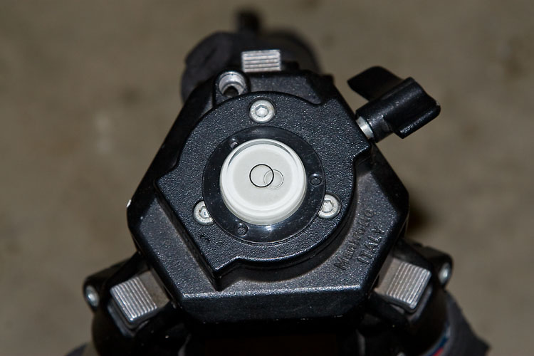
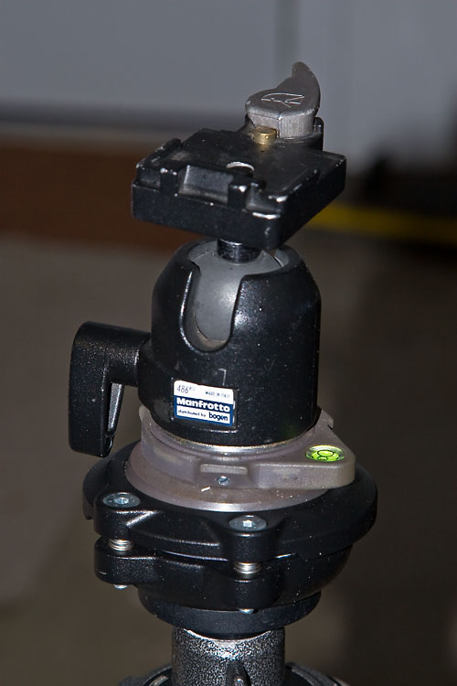
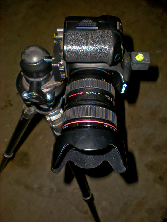
The second, and more recent, method I’ve used is by putting a leveling base on my tripod.  I use the Manfrotto 438 leveling base, but other companies like Acratech also make them.  They’re more expensive than my first method, but they’re way faster and you don’t have to fiddle with your tripod legs.  To level your camera on your tripod use a hot shoe level like the Jobu Designs Dubble Bubble level.

tripod head with manfrotto 438 leveling head

My tripod head can be leveled easily and quickly using the Manfrotto 438 leveling base.

level and set up for shooting panoramas

After leveling my tripod head, I level my camera on the tripod using a hotshoe level.

OK, now you’re level.  The rest of the pano practically shoots itself.  I usually work from left to right, making sure to overlap my images by anywhere from ~1/3-1/2.  This makes for a lot of images (many of mine are 12-15 images) but you’re almost sure to get a better stitch at the computer.

A couple of other things to consider before we discuss stitching:

  • To shoot vertical or horizontal…that is the question.  In stitching, you’re almost guaranteed to lose a little of the top and bottom of your images because the software will correct for barrel distortion.  Because of this, I almost always shoot my panos in a vertical orientation.  That way I’m left with an image that is a little more proportional, instead of something VERY long and skinny!
  • Just like with any shot, sharpness matters.  When I shoot panoramas, I almost always use a cable release and set my camera to shoot in mirror lock-up mode.  This reduces any possible vibration, hopefully ensuring a better stitch.
  • Do not change your focus or any camera settings while shooting your panorama.  However, consider bracketing your shots.  That way you have more to work with at the computer, and you can even consider making an HDR panorama (let’s save that for another blog post, please).
  • I haven’t addressed the problem of parallax yet.  Unless you are rotating on the nodal point of your lens (or using a pano slider), you will have parallax issues if anything in your pano is closer than ~10-15 feet.  The cheap solution is to make sure trees, rocks, etc are further than ~10-15 feet from my camera, and that seems to work to subdue parallax.  The obvious downside to my method is that you’re constrained as to your compositional choices.

So, now you’ve got your image files, and you’re back at the computer.  Can you simply align them in Photoshop manually, then crop the canvas down to its final size?  I think this works for most people ~1% of the time (I’ve managed to do it once, and I’m 99% sure it was dumb luck).  Every other time, the barrel distortion, as well as other factors, will necessitate the use of software to help you stitch your images together.

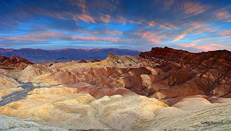
Panoramic photograph of Zabriskie Point at sunset, Death Valley National Park, California

Dumb luck. I stitched this 4-image pano together manually–I’ve never gotten it to work since.

For stitching panoramas, I use the software package Panorama Factory.  I like it because it has a fully automatic mode, which should work really well if you leveled your rig properly and provided enough overlap between images.  Alternatively, Panorama Factory allows for various levels of manual stitching, letting you define stitching points, and for the occasional difficult to stitch image, I like that mode a lot as well.  If you are interested in shooing HDR panoramas, Panorama Factory will stitch different sets of exposure identically so they overlay perfectly.  I have to admit that I’ve tried this once, and it didn’t work quite as smoothly as I’d like.  I’ve found that using the auto-align feature in Photoshop CS4 works well before blending images.

So, that’s basically it.  This tutorial was meant to get you taking beautiful panoramas using a minimal amount of equipment.  I hope you enjoyed it.  Feel free to add to the comment section if there’s anything I missed, or needs corrected.  Hope you can find this useful!

A panoramic photo of the Ritter Range, Sierra Nevada, California

An 11-image panorama of the Ritter Range, Sierra Nevada, California

Marginalia

Friday, August 14th, 2009


I’ve decided to make Fridays the day for Marginalia; noting things from the week.  For this week:

  • This weekend (Aug 15/16) is the U.S. National Parks free weekend!  Get out there and visit a national park for free.  For more info, click here.
  • Last week, I mentioned that Jay Goodrich guest blogged on Darwin Wiggett’s blog.  In return, Darwin and Samantha Chrysanthou guest blogged for Jay, again on the acceptable uses of Photoshop in photography.  A very thoughtful commentary, you should check out.
  • Speaking of Samantha, she recently blogged on the usefulness of social networking in photography.  So did Guy Tal.  So did a recent thread on Naturescapes.net.  The verdict?  Seems like resounding inconclusiveness.  I’m not sure if its worth it, but you can follow me on Twitter, Facebook, and Myspace.  In fact, please do.

That’s all I know this week.  See you where the light is.

High Dynamic Range photography, part I

Monday, August 3rd, 2009

Although its been popular for a while, I’ve recently begun working with multiple images to produce high dynamic range (HDR) photographs.  What is HDR?  HDR is a series of methods developed to produce a high dynamic range image from a set of photographs taken with a range of exposures.  There are multiple methods for producing an HDR image, from blending multiple shots in Photoshop to processing a single RAW image multiple times and blending those in Photoshop to using HDR software like Photomatix.

My goal here isn’t to tell you how to make an HDR photograph, because there are already fantastic tutorials out there, written by people much more talented than I am.  Probably the most complete tutorial was written by Royce Howland over at Naturescapes.net.

Because you can probably already produce an HDR image on your own, I want to share some nuances of the process I’ve learned to make your images look more realistic.  These aren’t new techniques, and I didn’t come up with all of them myself–to give credit where credit is due, Royce Howland, E.J. Peiker and Paul Stoczylas are the masters.  I’m but a student.

Part I: Getting rid of the halo

Photomatix is a powerful program and has a very user-friendly interface that pretty much does the work of producing an HDR image for you.  Because there are no monitors that can visualize that kind of dynamic range in an image, you must first tone map the image before being able to display it.  You have two options: Details Enhancer (DE) and Tone Compressor (TC).  DE is the default, and although it lacks some mid-tone contrast, it looks a lot better than a straight TC image which is way over-saturated.

The problem with tone mapping with only one algorithm is that you’re limited by each one’s constraints.  For instance, halos are a big constraint of the DE algorithm:

Towers of the Virgin 2Towers of the Virgin, Zion National Park, Utah, June 2009

This shot looks pretty good, but you notice at the junction between the sky and the cliffs that the sky turns noticeably light blue–that’s because I only tone mapped with the DE algorithm.

This halo can be especially problematic in images where you have trees against the sky.  In this series of posts, I’ll cover a couple of methods I’ve learned to make the HDR image look a little more  realistic and squelch that halo!

Stay tuned…